Picking the wrong veneer tone for your office wall panels can undercut a color-coded brand identity before a client ever sits down in your lobby. Here's how to choose acoustic panel color that reinforces office branding instead of fighting it, using the same logic Akuwood Panel applies to commercial installs in 2026.
- Acoustic panel color office branding starts with your logo's undertone, not the catalog — warm brands lean walnut, cool brands lean black oak.
- Natural Oak reads neutral enough for co-working and wellness brands with no dominant accent color. Verdict: Buy.
- Test swatches under your actual office lighting before ordering full panels — LED color temperature shifts veneer tone by a full shade.
- Black Oak suits tech and finance branding that leans dark and modern; Walnut suits hospitality and wellness brands that lean warm.
- Order the $10 sample box before a full order — mismatched veneer tone is the top reason offices redo a panel wall in 2026.
Why this matters
A reception wall is free advertising every time a client, candidate, or investor walks through the door. If your logo runs cool grays and blues but the wall behind your front desk is warm honey-toned oak, the two fight each other instead of reinforcing the same story.
Color is also the fastest way acoustic wood panels get returned or redone. A guide on matching panel color to existing flooring covers the flooring side of this problem; office branding adds a second constraint on top — your palette, your signage, your furniture finishes all have to agree with the panel tone at once.
Get the undertone wrong and you'll notice it fastest under office lighting, not on a laptop screen. That's the single most common complaint tied to color choice in 2026: a swatch that looked neutral in a sunlit showroom reads orange or gray under 4000K LED downlights.
What you'll need
- Your brand style guide or logo file with hex codes for primary and secondary colors
- Photos of the actual wall, taken under your office's real lighting (morning and evening if you have big windows)
- Swatches of existing flooring, trim, or furniture finish near the install wall
- A tape measure for the wall area you're covering
- A sample box of panel veneers before you commit to a full order
- 30-60 minutes to hold swatches against the wall at different times of day
The steps
1. Pull your actual brand hex codes
Don't eyeball this from memory — open your brand guide or logo file and write down the hex codes for your primary and secondary colors. Most branding disasters on a panel wall start because someone picked "the wood color that felt right" instead of matching an actual code.
If your primary brand color has an RGB value where red and green dominate over blue, you're working with a warm palette. If blue or gray dominate, you're cool. This single step decides half your veneer options before you look at a single panel.
Common mistake: designing around your logo's white space instead of its accent color. The accent color, not the background, is what a wood tone needs to complement.
2. Classify your undertone as warm, cool, or neutral
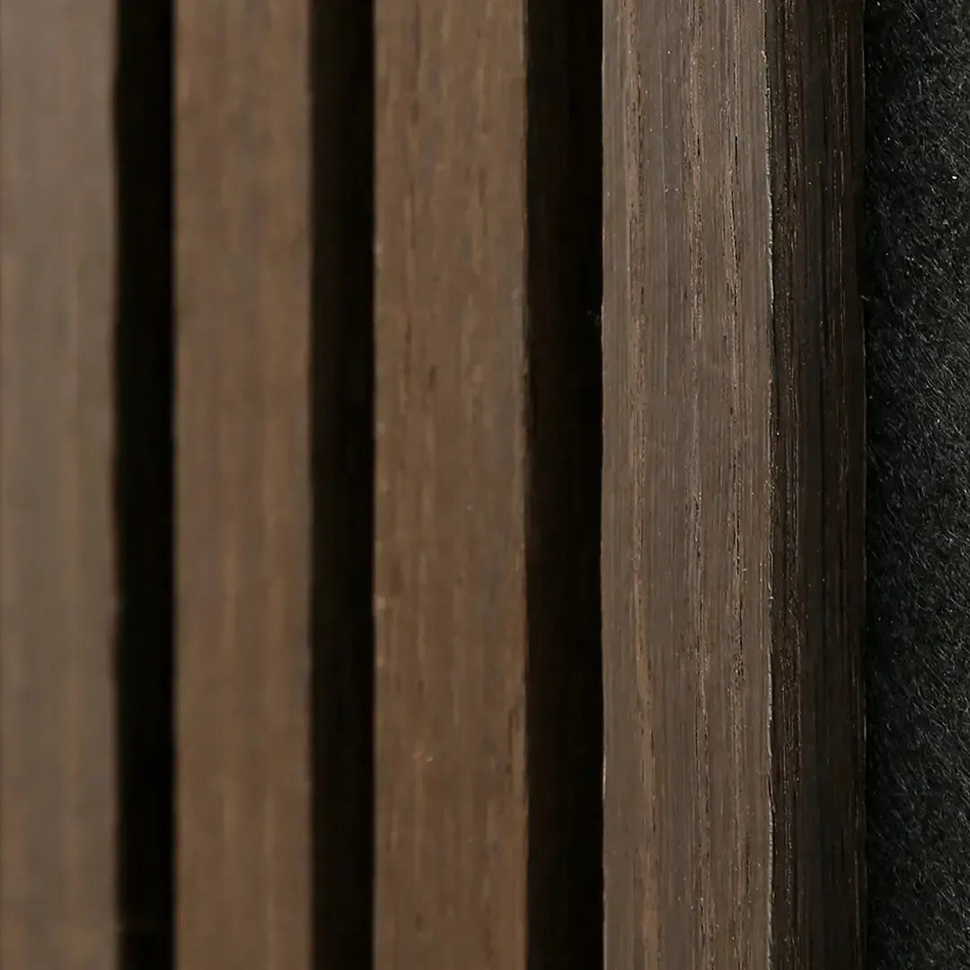
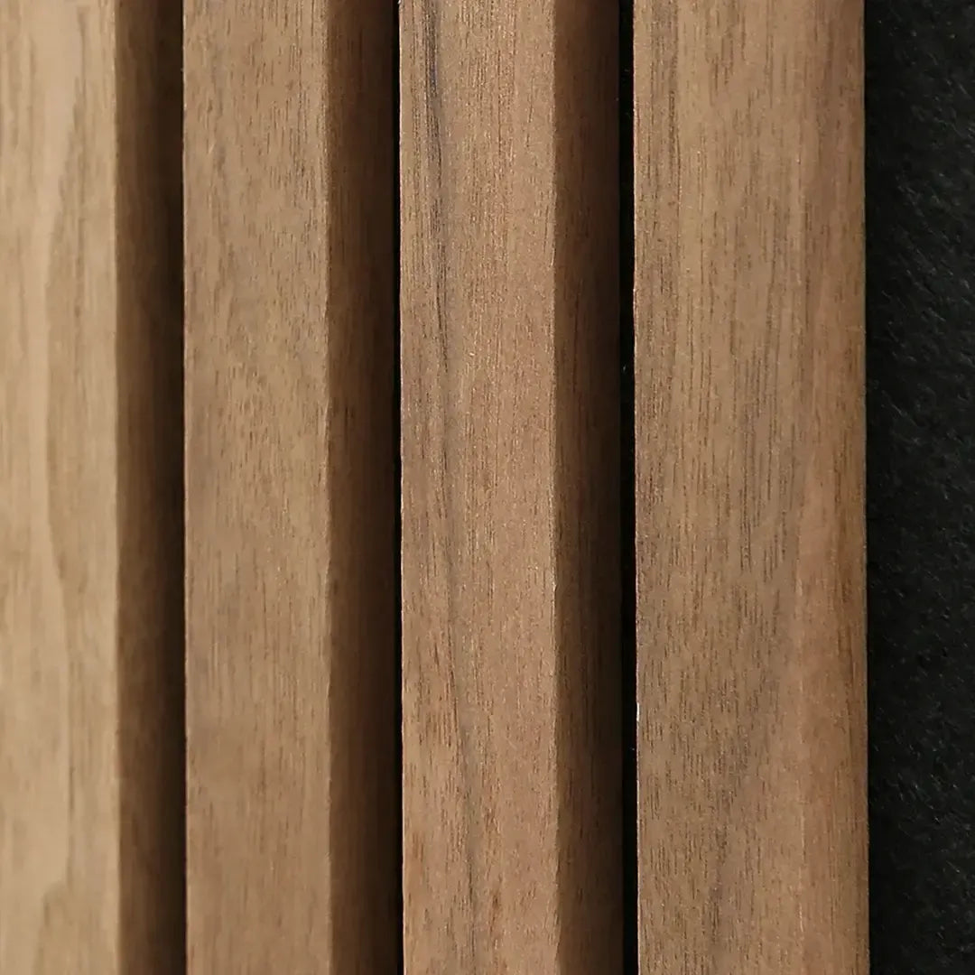
Warm brand palettes — amber, terracotta, gold, deep red — pair with veneers like Walnut or Rustic Oak that carry visible red-brown grain. Cool palettes — navy, slate, steel gray — sit better against Black Oak or Smoked Oak, where the grain reads darker and flatter under light.
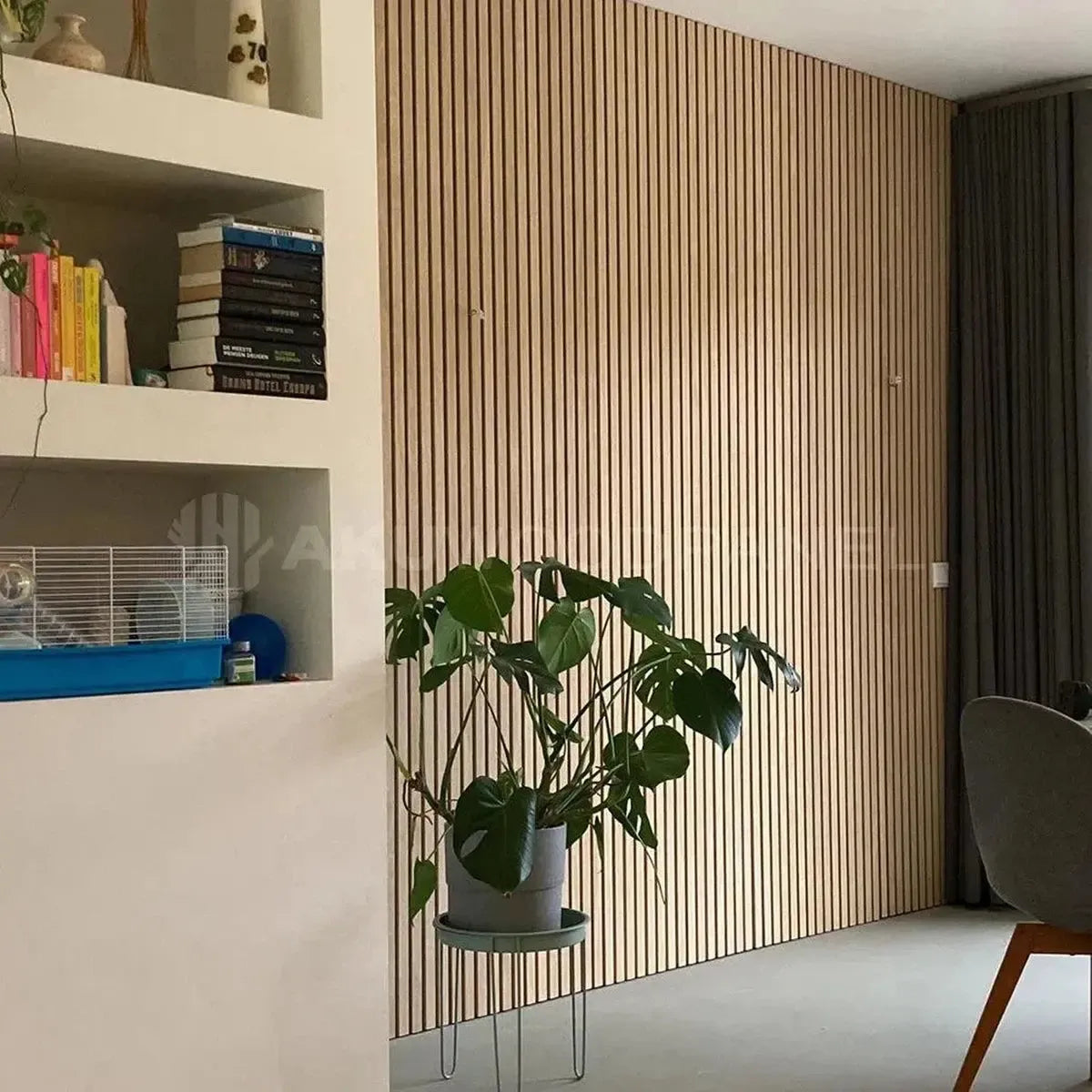
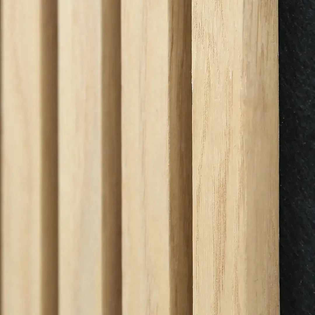
Neutral palettes built on white, beige, or sage green have the most flexibility and usually land on Natural Oak, which reads light without pulling warm or cool.
Hospitality and wellness brands in 2026 skew warm; fintech, SaaS, and legal brands skew cool. If your industry doesn't fit either bucket cleanly, default to a neutral oak tone and let your signage carry the brand color instead of the wall.
3. Match the veneer, not just the color name
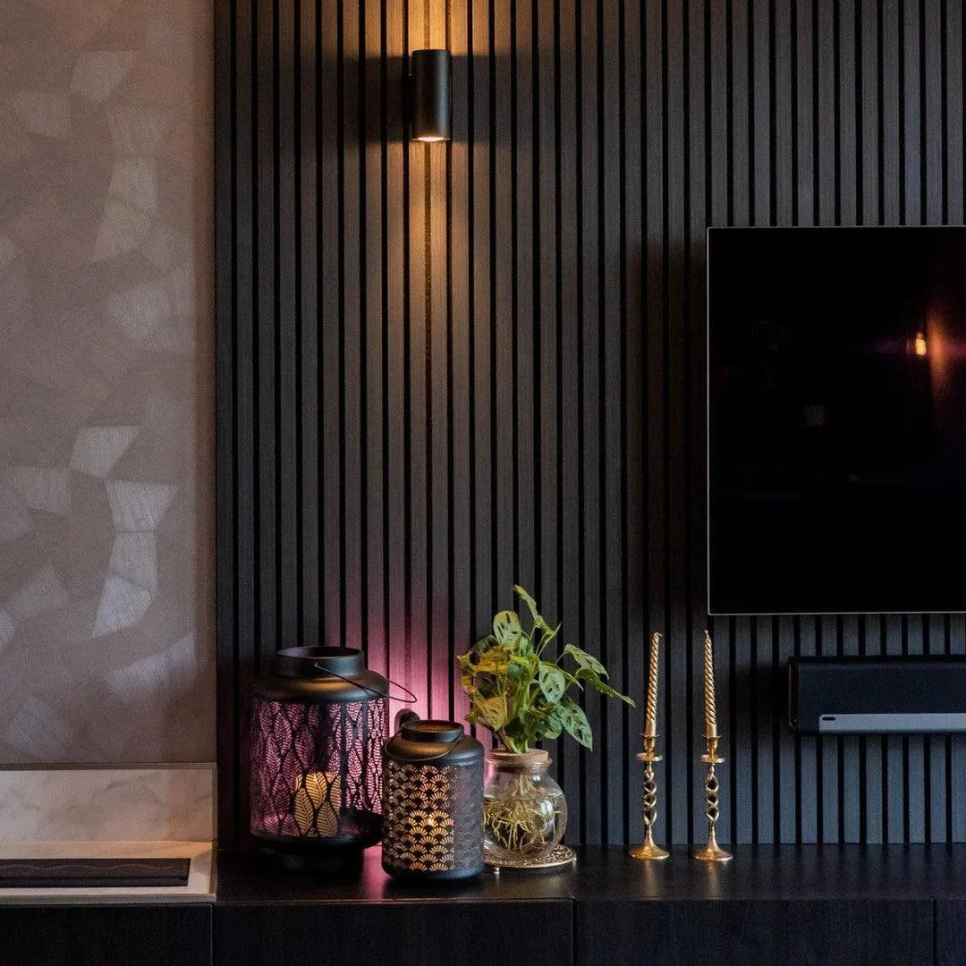
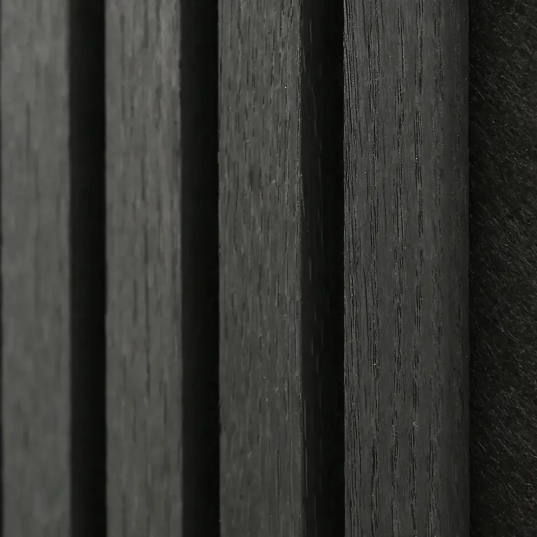
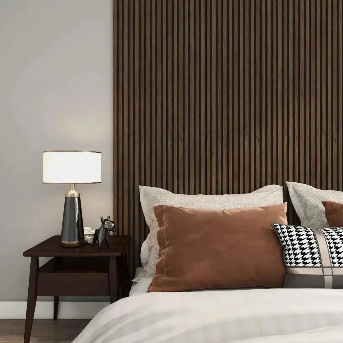
Once you know your undertone, shortlist two or three specific panels instead of a color family. For warm branding, Acoustic Slat Wall Panel Walnut carries a dark red-brown grain that reads confident without going black. For cool, modern branding, Acoustic Slat Wall Panel Black Oak gives a near-charcoal finish that photographs well behind glass and steel fixtures.
Buy: Walnut for hospitality, wellness, and boutique retail branding that leans warm and tactile. Buy: Black Oak for tech, finance, and legal branding that leans dark and minimal. Consider: Natural Oak if your brand identity is still evolving or you rotate signage colors seasonally.
4. Test the swatch under your real office lighting
This is the step most offices skip, and it's the one that causes reorders. Hold the panel sample against the wall at 9 a.m., at noon, and again after 5 p.m. with the office lights on. A veneer that looks neutral oak under daylight can shift orange under warm 3000K bulbs, or gray and flat under cool 5000K fixtures.
Common mistake: approving a color from a photo on the product page. Screen color rendering is not office lighting — always confirm with a physical sample under your own fixtures before ordering panels for the whole wall.
5. Cross-check against flooring, trim, and furniture
A wall panel doesn't exist in isolation. Stand the sample near your flooring, door frames, and any exposed metal or glass fixtures. If your floor runs light gray LVP and your brand is cool-toned, Black Oak or Smoked Oak keeps the room from looking mismatched. If your flooring is warm engineered hardwood, matching or slightly lighter oak tones avoid a jarring contrast.
This is also where reception desks and conference tables come into play — panel color should sit one or two shades apart from major furniture, not identical and not clashing.
6. Order a sample box before the full run
Before ordering panels for an entire wall, order the full sample box of slat wall panels, which ships with Natural, Smoked Oak, and Walnut finishes for about $10. Hold all three against your logo file and your real wall in real light before committing to square footage.
Expected outcome: by the end of this step you should have one clear winner, not two "maybe" options. If you're still torn between two tones after testing samples, pick the one that matches your dominant brand color, not your secondary one.
“If the panel color doesn't match under your office lighting, it doesn't match at all.”
Troubleshooting
The panel looks orange under office LEDs but neutral online. Your LEDs are likely running a warm color temperature below 3500K. Swap to a sample of a cooler-toned veneer like Black Oak or Smoked Oak, or change your bulbs to 4000K+ before finalizing color.
Brand colors are strong but the wood grain competes with them. Choose a flatter, more uniform grain like Black Oak instead of a high-contrast grain like Rustic Oak — less visual noise lets your signage and accent colors read clearly.
Two departments want two different tones. Standardize on one veneer for shared spaces (lobby, reception, hallways) and allow secondary tones only in private offices or meeting rooms where branding visibility is lower.
Panels arrived slightly different from the sample. Natural wood veneer varies batch to batch — this is expected with real wood and is one reason to order the sample box rather than trust a product photo alone.
The color reads right on the wall but wrong in photos for marketing. Camera white balance can shift veneer tone as much as office lighting does. Shoot a few test photos with your actual camera settings before scheduling a full brand photoshoot in the space.
Tools and resources
- Brand style guide with hex codes for primary and secondary colors
- A sample box covering multiple veneer tones before full-wall commitment
- Photos of the wall under morning, midday, and evening light
- A tape measure and rough square footage of the wall you're covering


Quick color-to-brand reference
| Brand palette | Recommended tone | Verdict |
|---|---|---|
| Warm, hospitality, wellness | Walnut | Buy |
| Cool, tech, finance, legal | Black Oak | Buy |
| Neutral, evolving, co-working | Natural Oak | Consider |
| High-contrast, industrial | Smoked Oak | Consider |
FAQ
What's the best acoustic panel color for office branding?
There's no single best color — the right acoustic panel color for office branding matches the undertone of your logo's primary color. Warm brand palettes pair with Walnut, cool palettes pair with Black Oak, and neutral palettes default to Natural Oak.
Is Black Oak better than Walnut for a corporate office?
Black Oak reads more modern and works better for cool-toned, minimal branding like tech or finance, while Walnut reads warmer and suits hospitality or wellness brands. Neither is universally better; the choice depends on your existing brand colors.
How much does an acoustic wood panel sample box cost in 2026?
A full sample box with Natural, Smoked Oak, and Walnut finishes costs around $10 in 2026. Testing samples against your brand palette before a full order avoids costly mismatched reorders.
Does office lighting really change how panel color looks?
Yes, LED color temperature can shift a veneer's appearance by a full shade. A panel that reads neutral oak in daylight can look orange under warm 3000K bulbs or flat gray under cool 5000K fixtures.
Should every room in an office use the same panel color?
Shared spaces like lobbies and hallways should standardize on one veneer tone for brand consistency, while private offices or meeting rooms have more flexibility to use a secondary tone.
Can acoustic panels match existing flooring and still match brand colors?
Yes, but flooring and branding sometimes pull in different directions, so match flooring undertone first, then check the veneer against your logo's hex codes before finalizing.
What panel color works for neutral or minimalist branding?
Natural Oak works best for neutral or minimalist branding since it doesn't pull strongly warm or cool, letting signage and accent colors carry the brand identity instead of the wall.
How many panel tones should a single office building use?
Most offices settle on one primary veneer tone for consistency and a single accent tone for meeting rooms or feature walls, rather than mixing three or more finishes across floors.
One last thing
The undertone test matters more than the color name on the product page. Two panels labeled "oak" from different runs can carry noticeably different warmth, and the only way to know for certain is holding a physical sample against your actual wall under your actual lights before the full order ships in 2026.
 Better performance and aesthetic appeal
 In Stock